Themes
A theme owns everything about how the form looks: the palette (per-role ANSI style codes) and the glyphs (selectors, markers, carets, separators - each a Unicode/ASCII pair). It never owns what is drawn or in what order - that belongs to the block. A block asks the theme for one element at a time, hands it a plain string and gets a styled one back, so a theme can repaint a breadcrumb but can't reorder one.
Three classes carry the arrangement. AbstractTheme is the floor: it implements every element and declares no capability, so it hands back the strings it was given. DefaultTheme sits on that floor with color, Unicode, a dark/light scheme, markdown, dimming, occupancy and element patching all declared - it's the class most custom themes extend, and a comfortable place to start rather than a requirement. ThemeManager turns a theme name into an instance, and it builds either one.
The page runs in that order: pick a shipped theme, see every piece one draws and the element behind it, then write your own or patch a handful of glyphs. Why the division of labor falls where it does is the specification.
Built-in themes
Six themes ship built-in, each selectable by name:
use DrevOps\PhpTui\Builder\Form;
use DrevOps\PhpTui\Tui;

$tui = (new Tui(Form::create('My form')))->theme('midnight');
| Name | Palette |
|---|---|
default | Cyan accents on a neutral base - the out-of-the-box look. |
midnight | Violet accents, green values, pink highlights. |
frost | Arctic frost-blue accents, sage values, sand highlights. |
ember | Burnt-orange accents, olive values, gold highlights. |
mono | Hue-free - bold weight, gray levels and reverse video, for maximum compatibility. |
dos | Retro MS-DOS - the bright white/cyan/yellow CGA palette in a double-line window, painted on its own blue screen. |
The colorful themes use 256-color palettes, mono the grayscale ramp and dos the classic 16-color CGA set. Every one renders across all fields and degrades to plain text when color is off. An unknown theme name fails loudly, so a typo never silently lands you back on the default.
Each adaptive theme below is shown in four looks: the dark and light palettes, each rendered once inside the default rounded border and once with the frame explicitly stripped (['border' => 'none']). Every adaptive theme has a runnable script in playground/09-themes-*.
midnight
| Dark | Light | |
| Borderless | 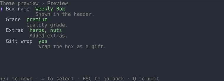 | 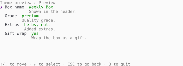 |
| Bordered | 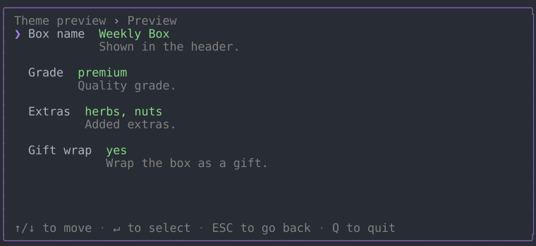 | 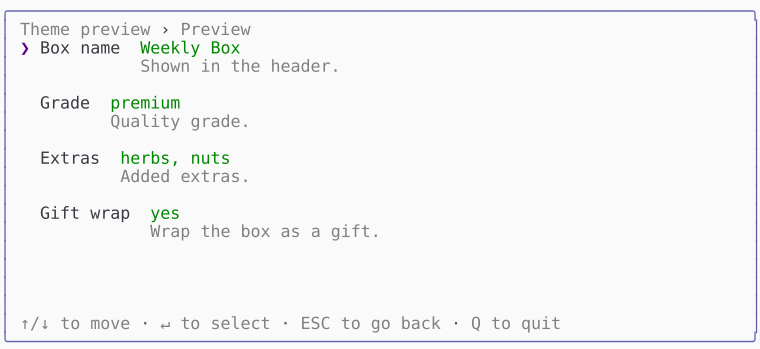 |
frost
| Dark | Light | |
| Borderless | 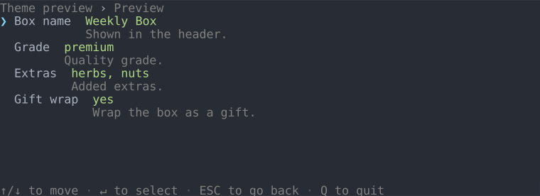 | 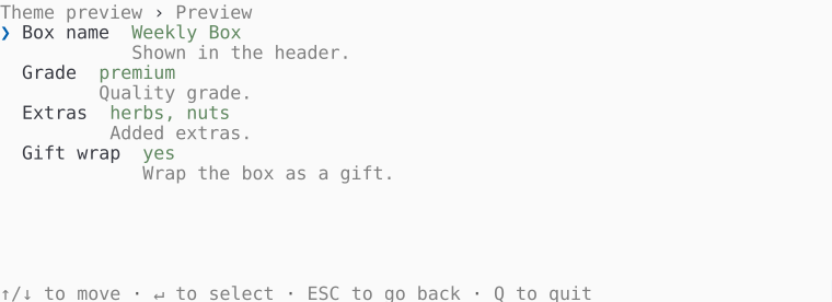 |
| Bordered | 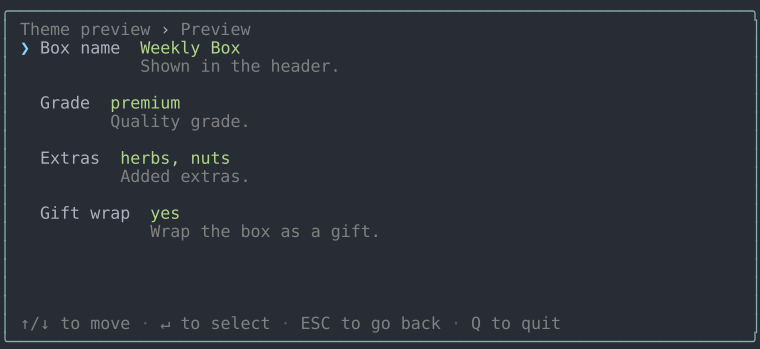 | 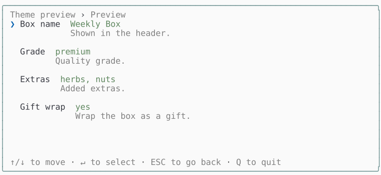 |
ember
| Dark | Light | |
| Borderless | 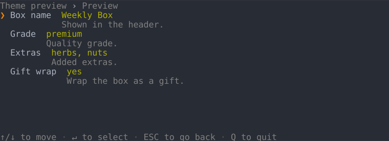 | 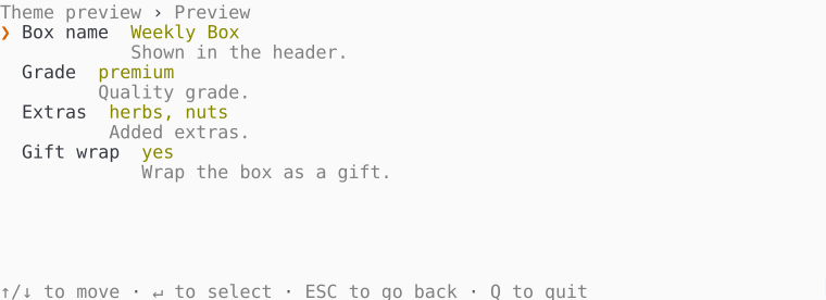 |
| Bordered | 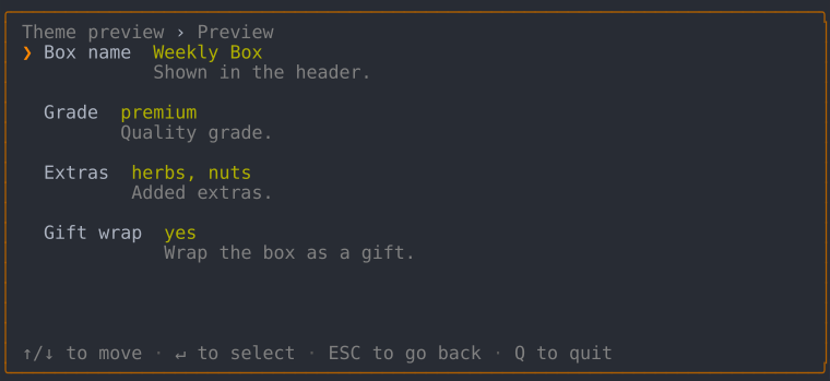 | 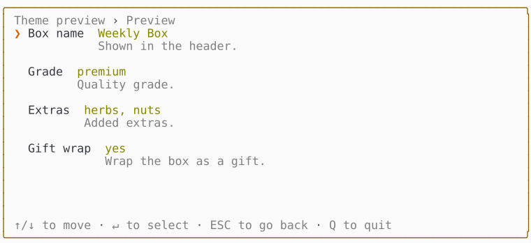 |
mono
| Dark | Light | |
| Borderless | 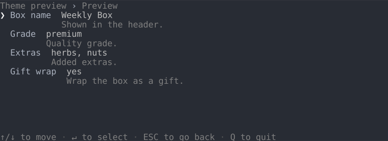 | 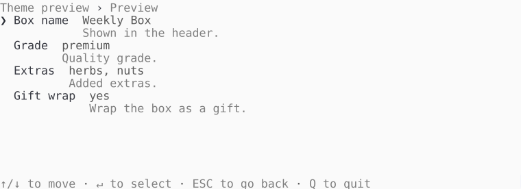 |
| Bordered | 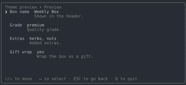 | 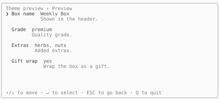 |
dos
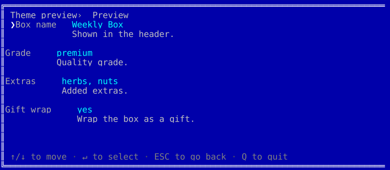
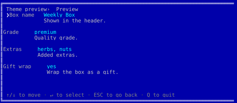
The CGA blue screen, painted regardless of the terminal background. The theme draws its own double-line window, so there's no bordered/borderless split - the window is its frame:
Dark and light
Dark and light aren't separate themes - they're a mode display option that every theme honors. Leave mode unset, whichever theme you picked, and the interactive TUI reads it off the actual terminal background: it queries the background color over OSC 11, falls back to the COLORFGBG environment variable, and settles on dark when neither answers. With color off the query is skipped and the mode is dark, since an unpainted palette has nothing to suit.
(new Tui($form))->theme('frost', ['mode' => 'light']);  // force light
(new Tui($form))->theme('frost');                        // auto-detect
Display options
Every theme built on DefaultTheme takes the same options array, validated in its constructor - an unknown key, a value outside the allowed set, or a minimum size above its own maximum throws there, naming what it would accept. A theme built straight on the floor reads no option at all, so it validates none either. These are all of them:
| Option | Values | Does |
|---|---|---|
mode | Mode::Dark, Mode::Light | which palette suits the terminal background; detected when unset |
color | TRUE, FALSE | whether anything paints at all |
unicode | TRUE, FALSE | whether glyphs may reach past ASCII |
markdown | TRUE, FALSE | whether the markdown subset is drawn rather than its markers |
indent_conditional | TRUE, FALSE | whether a conditional field steps in from the answer that reveals it |
spacing | Spacing::Compact, Spacing::Normal, Spacing::Padded | what shows between the rows a region holds |
border | Border::None, Border::Line, Border::Rounded, Border::Double | the frame drawn around everything |
field | FieldStyle::Flat, FieldStyle::Boxed, FieldStyle::Underline | how a field's typed value is drawn in the editor |
fullscreen | TRUE, FALSE | whether the frame takes the whole terminal |
halign | HAlign::Left, HAlign::Center, HAlign::Right | where a frame narrower than the terminal sits across it |
valign | VAlign::Top, VAlign::Middle, VAlign::Bottom | where a frame shorter than the terminal sits down it |
min_width | any non-negative integer | the narrowest terminal the frame can be read in; 0 measures the content |
min_height | any non-negative integer | the shortest terminal it can be read in |
max_width | any non-negative integer | the widest the frame will grow; 0 is uncapped |
max_height | any non-negative integer | the tallest it will grow; 0 is uncapped |
Each enum case is interchangeable with its string value, so ['border' => Border::Rounded] and ['border' => 'rounded'] mean the same thing. A theme can declare options of its own by merging over optionSchema(), and the playground's accent theme is that recipe in fifteen lines.
What a theme draws
A screen has two layers. The window chrome frames the whole form and belongs to no field in particular: the border, the trail of panel titles, the key legend. Inside it, each field draws itself in one of two modes. In view mode it's a single line carrying the answer. Open it and it switches to edit mode, where the field takes over the space right of the label.
An atom is one named piece of that interface - the smallest thing worth naming on its own, and the unit a theme restyles. Every atom is drawn by an element, the method a theme answers with, and Elements below lists all of them - not just a field's, but every block's.
The vocabulary is settled; open questions tracks what isn't.
Window chrome
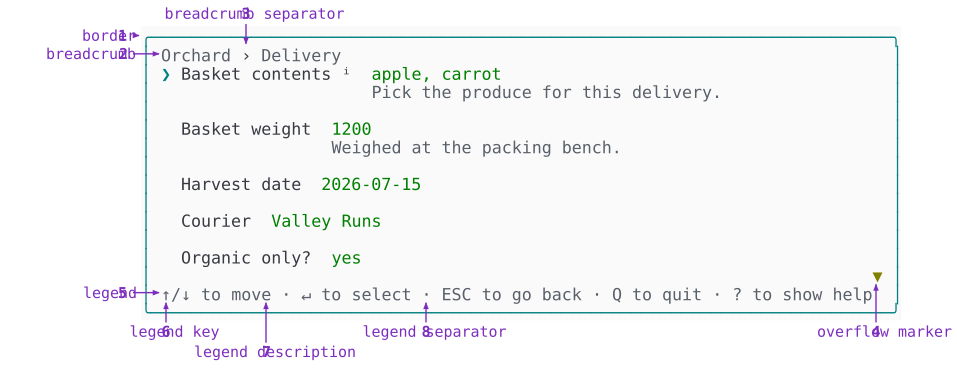
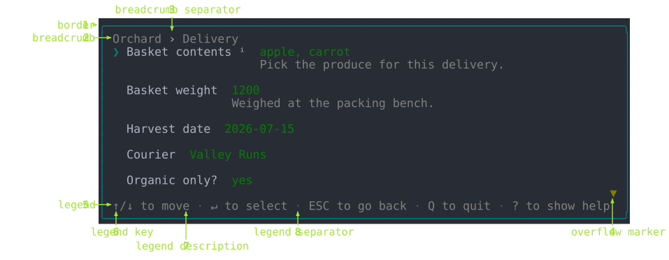
The chrome is the same whatever the form asks. You declare it once - the form's title and its panels' titles feed the trail, the theme picks the border - and it maintains itself from there. The trail gains a segment as you descend, the legend rewrites itself as focus moves, the overflow marker appears when the rows outgrow the frame.
| # | Atom | What it does | Set with | Theme element |
|---|---|---|---|---|
| 1 | border | The frame around everything. One of Border::None, Border::Line, Border::Rounded or Border::Double, form-wide. | Tui::theme(..., ['border' => Border::Rounded]) | chromeBorder() |
| 2 | breadcrumb | The trail of panel titles: every panel you've descended through, plus the one you're in. | Form::create('Orchard'), ->panel('Delivery', ...) | breadcrumbLabel() |
| 3 | breadcrumb separator | Stands between breadcrumb (2) segments. | Not declared | breadcrumbSeparator() |
| 4 | overflow marker | Points at content past the top or bottom edge. Drawn only when the rows outgrow the frame. | Not declared | chromeOverflowMarker() |
| 5 | legend | The keys bound right now. | Tui::footer(FALSE) hides it; the entries come from the field | the Legend block itself |
| 6 | legend key | One key in the legend (5). Worded keys are uppercased: ESC, TAB, SPACE. | Tui::keys(...) rebinds which key it shows | legendKey() |
| 7 | legend description | What that key does. Reads as KEY to action. | Not declared; comes from the field | legendDescription() |
| 8 | legend separator | Stands between legend (5) entries. | Not declared | legendSeparator() |
The legend (5) is the one atom of the chrome that changes as you work: it lists the keys that apply where you are, so an open field advertises different keys from the panel around it. It's written from the live bindings and never by hand - it's handed the map a key press resolves against and reads the glyphs back out of it - so a rebound key changes the line advertising it rather than drifting from it. That's also why a legend key (6) needs no weight of its own. Case alone tells ESC from the words beside it, and the KEY to action wording of a legend description (7) makes an entry read as a sentence rather than two words abutted.
A legend (5) with more entries than the frame has room for drops them whole, from the end, keeping at least one however narrow the frame gets. An entry cut mid-word reads as a different word, and the entries a reader reaches for first are the ones declared first, so the line sheds from the far end rather than wrapping or clipping.
View mode
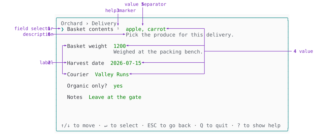
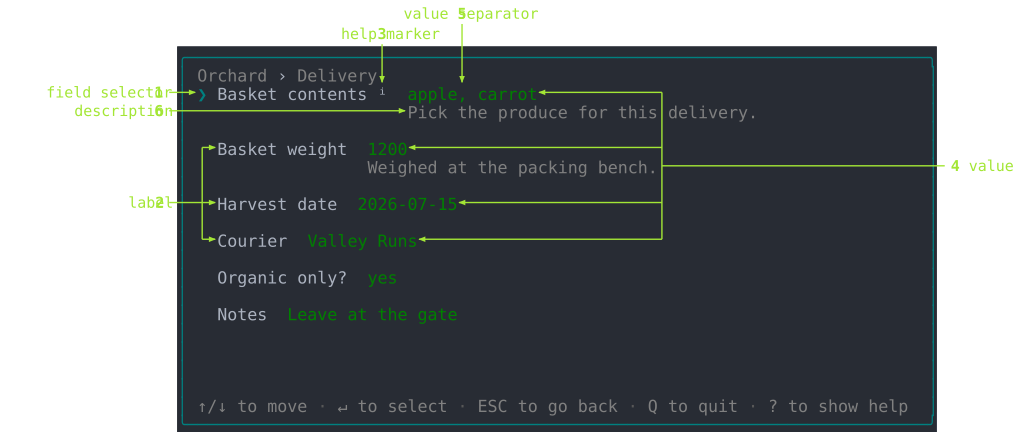
A panel stacks its fields as rows, each one in view mode until you open it. A row is a single line: the field's name, its answer, and the marks that say where focus is and whether there's more to read.
| # | Atom | What it does | Set with | Theme element |
|---|---|---|---|---|
| 1 | field selector | Which field has focus. Moves with ↑ and ↓. | Not declared; follows focus | fieldSelector() |
| 2 | label | The field's name. Every row has one. | $p->select('Basket contents') | fieldLabel() |
| 3 | help marker | Marks a field carrying help (7). Sits after the label (2), in the label's own color and never bolded. | Not declared; appears when the field has help (7) | fieldHelpMarker() |
| 4 | value | The settled answer. Empty until the field is answered, and never what you're mid-way through typing. Every row has one. | ->default(['apple', 'carrot']), then whatever is answered | fieldValue() |
| 5 | value separator | Stands between the parts of a value (4) that has more than one, so Basket contents reads apple, carrot. | Not declared | fieldValueSeparator() |
| 6 | description | The field's explanatory text, under its row. | ->description('Pick the produce for this delivery.') | fieldDescription() |
| 7 | help | The field's long-form text. Never drawn in the panel: ? opens it on a page of its own. | ->help('Every crate is weighed at the packing bench.') | a bordered Markup block |
Only one field holds focus at a time. The row the field selector (1) sits on is drawn brighter too, so the glyph and that emphasis are one signal in two forms.
The label (2) is the one atom every row draws, and the only one that never changes while you work. That's why the help marker (3) hangs off it rather than off the description (6): a field can carry help (7) without carrying a description (6).
Two pairs are easy to confuse, and both come down to length or timing. A description (6) has to fit under the row, so it stays a sentence; help (7) opens on a page and can run to paragraphs, which is why a long help never widens the panel it was declared on. A value (4) is what was accepted; the draft (edit 9) is what you're typing.
Edit mode
Edit mode hands the region right of the label to the field, and what the field draws there depends on how it collects an answer. The three shapes below cover it: choosing from a list, typing, and browsing.
Choosing from a list
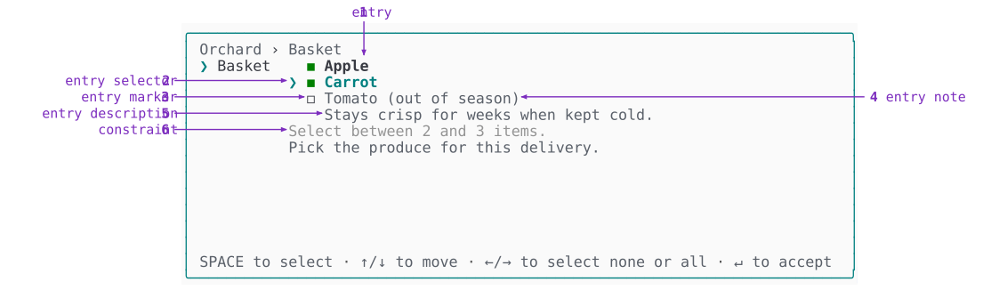
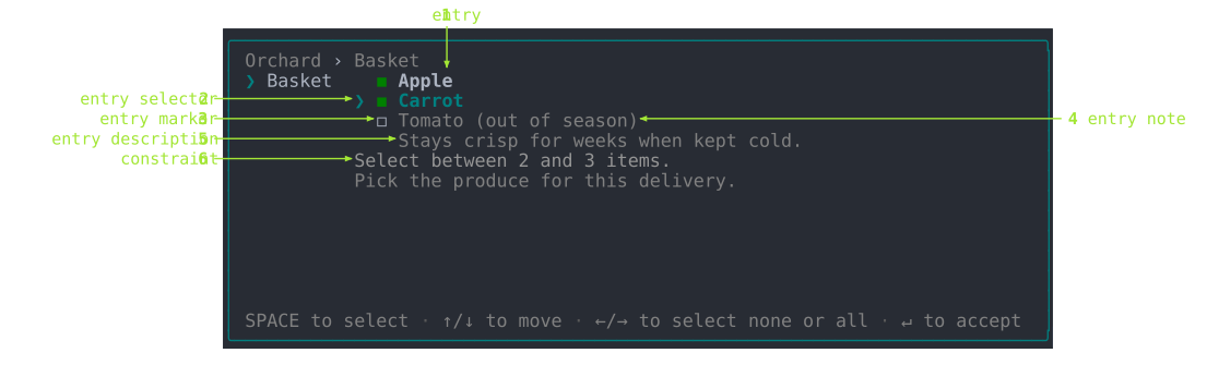
A multiple-choice field with bounds and per-entry text draws the fullest set of atoms.
| # | Atom | What it does | Set with | Theme element |
|---|---|---|---|---|
| 1 | entry | One line of the list the field offers. | ->option('apple', 'Apple'), ->options([...]) | fieldEntry() |
| 2 | entry selector | Which entry (1) has focus. Moves with ↑ and ↓. | Not declared; follows focus | fieldEntrySelector() |
| 3 | entry marker | The per-entry chosen-state glyph. | ->multiple() picks which pair of glyphs | fieldEntryMarker() |
| 4 | entry note | A qualifier on an entry (1), such as why it's unavailable. Drawn only on entries carrying a reason. | ->option('tomato', 'Tomato', disabled: TRUE, disabled_reason: 'out of season') | fieldEntryNote() |
| 5 | entry description | The focused entry (1)'s own explanatory text. Indented to start where the entry text starts. | ->option('carrot', 'Carrot', description: 'Stays crisp for weeks when kept cold.') | fieldEntryDescription() |
| 6 | constraint | What the field expects, before anything is rejected. | ->minSelections(2)->maxSelections(3), ->maxSize(64), ->min()/->max() | fieldConstraint() |
What fills the list varies by field: a fixed set, a set filtered as you type, or one fetched by a query. An entry description (5) is rewritten every time the entry selector (2) moves, and is absent for entries that declare none - which is why it's indented to the entry text rather than to the list, so it reads as belonging to the entry above it.
Selecting and marking are different things. A selector shows where you are; a marker shows what you've marked. That's why the entry selector (2) and the field selector (view 1) are the glyphs that follow your movement, while the entry marker (3) is the box that records a decision. Moving a selector chooses nothing. The entry marker (3) only changes when you pick something, which in a multiple-choice list is Space.
The pairs are deliberate. The field selector (view 1) shows which field you're on and the entry selector (2) which entry within it; the description (view 6) is the field's own text and the entry description (5) an entry's. Same idea at two levels, so a parent's name is never reused for its child.
Typing rather than choosing
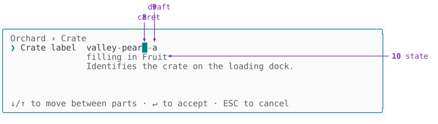
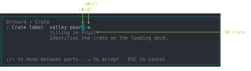
Some fields collect an answer by typing instead of by choosing from a list, so they have no entry (1) at all. The Template field fills the named slots of a fixed pattern.
| # | Atom | What it does | Set with | Theme element |
|---|---|---|---|---|
| 8 | caret | The insertion point within the draft (9), showing where the next keystroke lands. | Not declared; follows what you type | fieldCaret() |
| 9 | draft | The text you're typing, before it's accepted. | ->default('valley-pear-a') seeds it; typing changes it | fieldDraft() |
| 10 | state | What the field is doing right now. | ->slot('fruit', 'Fruit') names what it reports | fieldState() |
The draft (9) and the value (view 4) are the same answer at two moments: what you're typing, and what was accepted. Accepting promotes one to the other; canceling discards the draft (9). In the Template field the caret (8) is also what moves between slots as you fill them.
The state (10) is easy to confuse with the description (view 6), so it's worth being precise. The first tracks the field and changes while you work - here it names the slot you're filling. The second belongs to the field and never moves.
Browsing a list
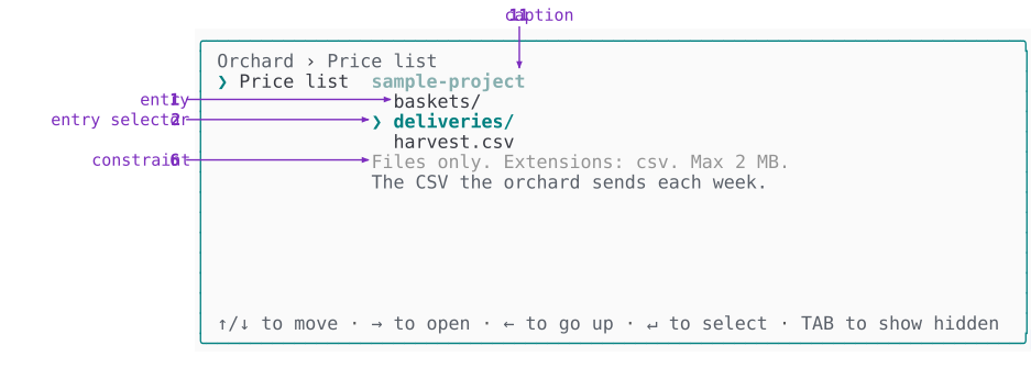
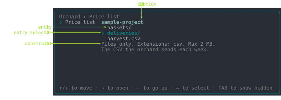
The FilePicker field draws the same skeleton over a directory listing, and adds a caption (11) above it.
| # | Atom | What it does | Set with | Theme element |
|---|---|---|---|---|
| 11 | caption | What the list below is showing. Rewritten whenever the list changes underneath it. | ->startIn($directory) sets where it begins | fieldCaption() |
The lines in the list are files and directories rather than options, and they're still entries (1): the name describes the line the field offers, not where its content came from. The caption (11) names a directory in this field because that's what a file browser browses, but the atom - and the theme method that draws it - stays generic.
Constraint and error: one line, two states
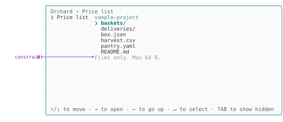
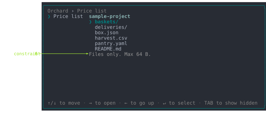
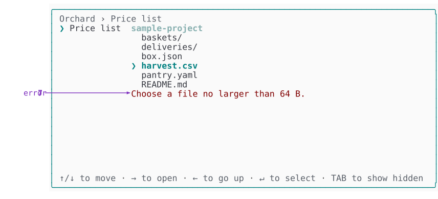
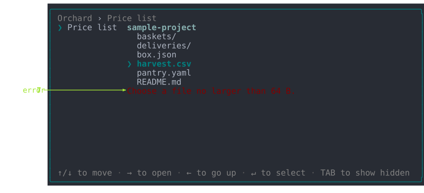
The constraint (6) and the error (7) share a single physical line. A FilePicker field limited to files of at most 64 bytes shows both states of it.
Nothing has been picked yet, so the line states what the field expects:
Now harvest.csv is picked, and at 88 bytes it breaks that limit. The same line, in the same place, turns into the error (7). The constraint (6) doesn't move down or stay above it - it's replaced:
| # | Atom | What it does | Set with | Theme element |
|---|---|---|---|---|
| 7 | error | Why the value was rejected. Drawn only after a refused accept, and cleared the moment the value becomes acceptable. | The declared bounds, or ->validate(...) | fieldError() |
The two lines say different kinds of thing:
| Line | Says | |
|---|---|---|
| constraint (6) | Files only. Max 64 B. | what the field will accept, before you act |
| error (7) | Choose a file no larger than 64 B. | why what you just did was refused |
A constraint (6) describes the field; an error (7) describes your value. A constraint (6) is there from the moment edit mode opens, and hands the line over the instant a value is refused; the error (7) hands it back as soon as the value is acceptable again.
That's also why they're built differently. The first is an unframed phrase - a file no larger than 64 B - that its caller wraps, so the same phrase becomes Choose ... in the picker, Select ... in a bounded list and must be ... headlessly. The second is already a whole message, and is shown as it stands.
Elements: what a theme actually implements
An atom is what you see. An element is the method a theme answers with, and every one of them takes plain strings, scalars and enum cases, and returns a styled string. That is the whole contract: order, spacing and how many elements there are belong to the block; color and glyph belong to the theme.
Elements are grouped by the block that declares them, in one interface per block, and each is prefixed with its owner's name so a theme can implement every interface on one class without a collision. A theme that doesn't implement a block's interface can't draw that block, and it says so by name rather than leaving a blank line.
ThemeInterface itself carries only two methods, because only two belong to no block at all: contentWidth(), the one width every block lays out against, and keyGlyph(KeyName|string $key), so the legend, a field naming a key in a prompt and the notice saying how to quit all spell the same key the same way. The two theme-wide methods take what an element takes and nothing more - a named key travels as its KeyName and a typed one as the character it writes, so the value object an input layer carries a press around in stops where it was built. One thing beside them is a number rather than a method: DEFAULT_WIDTH, the width a theme lays out to when no terminal has been measured, which belongs to the contract because everything building a theme without a terminal in front of it needs the same answer.
The chrome
ChromeElementsInterface is the one interface named for something other than a block, because what it draws belongs to no block: the frame surrounding every region at once, the mark saying a region's contents outran it, the gutter every block that comes and goes with the answers steps in behind, and the air between two things drawn side by side. The specification has why that follows from the model.
| Element | Draws |
|---|---|
chromeBorder() | the border (chrome 1) - the run of box-drawing characters |
chromeOverflowMarker() | the overflow marker (chrome 4), told whether it points up |
chromeGutter() | the columns left clear between two things drawn side by side, as a count rather than a string |
chromeIndent() | the blank gutter a block behind a condition is laid out after, given how many answers put it there at all |
chromeGutter() is read in two places and spent in one: a grid takes it off the width before dividing what is left between the windows of a visual row, and the renderer leaves exactly that many columns when it joins what they drew. Answering 0 runs them against each other; the floor answers 1 and DefaultTheme answers 2.
The trail, the keys and the buttons
| Interface | Element | Draws |
|---|---|---|
BreadcrumbElementsInterface | breadcrumbLabel() | one segment of the breadcrumb (chrome 2) |
breadcrumbSeparator() | the breadcrumb separator (chrome 3) | |
LegendElementsInterface | legendKey() | a legend key (chrome 6) |
legendDescription() | a legend description (chrome 7) | |
legendSeparator() | a legend separator (chrome 8) | |
ActionsElementsInterface | actionSelector() | the mark saying the buttons have the cursor |
actionButton() | a button that would not be pressed | |
actionSelected() | the button that would be pressed | |
actionSeparator() | the gap standing between two buttons | |
actionRefusal() | the reason the form cannot be ended yet |
The brackets around a button belong to actionButton(), not to the block. A theme that frames a button differently changes that one method, and the block goes on knowing only that it has labels and one of them would be pressed.
The rules above and below them belong to no element here at all. The buttons are an ordinary block declaring a border of two sides, so the renderer draws them the way it draws every other border - see the border capability.
Where the cursor is and which button it would press are two questions, so they are two elements. actionSelector() answers the first the way fieldSelector() and panelSelector() answer it for the rows above - a mark in the same column, so the buttons line up with everything else the cursor walks - and it is a glyph rather than a color for the same reason those are: with color off a row that said only actionSelected() would read the same whether or not you were standing on it. actionSelected() answers the second, and only where the first is answered yes: off the row, no button is drawn as the one a key press would reach, because none of them is.
Withholding the submit reads as one thing with the buttons it withholds, so actionRefusal() is an element of the same block rather than a note somebody else draws above them. The reason is drawn flush above the buttons, off the selector's column since it is not somewhere the cursor can be, and nothing comes between a refusal and what it refuses.
A nested panel's row
A panel draws a row of its own only as a sub-panel - the shape you select to enter. Once you are inside it, it draws nothing itself: its blocks do.
| Element | Draws |
|---|---|
panelSelector() | which row has focus |
panelTitle() | the sub-panel's title |
panelDescend() | the mark saying the row leads somewhere |
panelDescription() | the sub-panel's standing text |
panelSummary() | the run of answers the sub-panel is holding |
panelSummarySeparator() | the mark standing between two answers in that run |
A field, in both of its modes
One field owns both modes, so one interface names both. FieldElementsInterface is the largest of them for that reason.
| Element | Draws |
|---|---|
fieldSelector() | the field selector (view 1) |
fieldLabel() | the label (view 2) |
fieldHelpMarker() | the help marker (view 3) |
fieldValue() | the value (view 4) |
fieldValueSeparator() | the value separator (view 5) |
fieldMask() | one character of a secret, standing in for what was typed |
fieldBadge() | the mark saying where an answer came from - default, detected, edited, derived, override |
fieldDescription() | the description (view 6) |
fieldEntry() | an entry (edit 1), told whether it is picked and whether the cursor rests on it |
fieldEntryMatch() | the run of an entry's label that answers what was typed |
fieldEntrySelector() | the entry selector (edit 2) |
fieldEntryMarker() | the entry marker (edit 3), told whether picking gives up every other choice |
fieldEntryNote() | an entry note (edit 4) |
fieldEntryDescription() | an entry description (edit 5) |
fieldEntrySeparator() | the mark standing between two runs of entries |
fieldOverflowMarker() | the mark saying a list runs past the page it is windowed to, told whether it points up |
fieldConstraint() | the constraint (edit 6) |
fieldError() | the error (edit 7) |
fieldCaret() | the caret (edit 8) |
fieldDraft() | the draft (edit 9) |
fieldGhost() | the completion offered after the draft, which nobody typed |
fieldInput() | the whole typed line: draft, caret and completion in one piece |
fieldScale() | the run of points a graded answer reads as |
fieldLoading() | the word saying the field is still fetching what it will offer |
fieldState() | the state (edit 10) |
fieldCaption() | the caption (edit 11) |
Four of these answer with a whole composed line rather than one styled string - fieldInput(), fieldScale(), fieldEntryMarker() and fieldEntrySelector(). Each still takes plain scalars and nothing else, so the piece stays the theme's to arrange without the field handing over any of its state. fieldInput() is one piece rather than three because where the caret sits is a position within the draft rather than a thing beside it, so only whatever draws the draft can put it there.
Two elements draw an overflow mark, and they say different things. fieldOverflowMarker() says a list the field owns ran past the page it windows it to; chromeOverflowMarker() says a region ran past the space the layout gave it. They start out identical, and a theme can send them apart without touching the other.
A passage of text
MarkupElementsInterface draws prose wherever it appears - a field's description (view 6), a standing note, the page behind the help (view 7) key. A passage is not one string with one style, so each span is its own element and a theme restyling what is emphatic restyles it everywhere.
| Element | Draws |
|---|---|
markupTitle() | the title above a body of markup |
markupLine() | one line of it |
markupStrong() | a span the passage states emphatically |
markupEmphasis() | a span it leans on |
markupCode() | a span it quotes verbatim |
markupLink() | a span that leads somewhere, given the label and the target |
markupBullet() | the mark leading one item of a list |
Work in progress
ProgressElementsInterface covers the progress row and the progress primitive alike.
| Element | Draws |
|---|---|
progressSelector() | the mark saying the work has the cursor |
progressCaption() | the caption naming the work |
progressSpinner() | the spinner glyph for a frame number |
progressTrack() | the filled and empty run of a bar |
progressCount() | the tally beside it |
progressSpinner() takes the frame number rather than a glyph, so the theme owns both the animation's characters and how many there are - a Unicode theme can spin through ten frames where an ASCII one cycles four.
progressSelector() is the row's alone. The row takes the cursor and starting the work is a key press away from it, so it marks itself the way a field row does; the primitive takes no cursor, runs its own work and draws no mark.
The finished pieces a primitive draws
The primitives collect nothing and never run inside a panel, so they cannot ask a block for anything. What they draw is a whole finished piece, declared in PrimitiveElementsInterface:
| Element | Draws |
|---|---|
renderCard() | a heading, a body and an optional grid, boxed or indented |
renderTable() | an aligned, bordered grid of headers and rows |
renderText() | source text as wrapped, markup-styled lines |
renderRule() | a line spanning the frame |
renderBanner() | a logo above an optional version line |
renderStatus() | one of the five status lines: its glyph and its message |
renderDefinitions() | label/value pairs as an aligned definition list |
renderSpinner() | an indeterminate spinner beside its caption |
renderProgressBar() | a determinate bar with its step count and label |
renderCard() is the single renderer behind both the standalone card and the one a markup block draws in a panel - grid included, since a markup grid is a card with a grid in it - so overriding it restyles the two together. renderTable() draws the standalone grid. Every method here takes plain strings and arrays: a renderer that reached for a field, a panel or an answer set could only ever be used from inside a form.
Writing a theme
A custom theme subclasses DefaultTheme and repaints. Most of what a palette wants is written once, in a small set of protected voices the elements draw from - so a theme repaints a whole family in a line rather than element by element:
| Voice | Says |
|---|---|
accent() | "here", "now" or "picked" - the hue a theme is recognized by |
value() | what something holds |
label() | what something is called |
title() | a name for what follows it |
heading() | a name over a run of rows |
description() | what explains something |
guidance() | what the form expects of you |
footer() | an aside, never the point of the line |
border() | box-drawing characters |
indicator() | something that wants attention without having failed |
error() | something that failed |
use DrevOps\PhpTui\Theme\DefaultTheme;
use DrevOps\PhpTui\Theme\Sgr;

class AquaTheme extends DefaultTheme {

  #[\Override]
  protected function accent(): string {
    return $this->isDark ? Sgr::of(Sgr::Bold, Sgr::Cyan) : Sgr::of(Sgr::Bold, Sgr::Blue);
  }

  #[\Override]
  protected function value(string $text, bool $emphatic = FALSE): string {
    return $this->paint($this->emphasize($this->isDark ? Sgr::of(Sgr::Sky) : Sgr::of(Sgr::Cobalt), $emphatic), $text);
  }

}
Colors come from the Sgr palette map - named cases like Sgr::Cyan or Sgr::Sand, composed with Sgr::of(...) - so a palette reads as colors rather than raw ANSI numbers. paint() wraps text in a style and honors the color switch; emphasize() adds weight to whatever the cursor is on. Midnight, frost and ember are each five overrides of exactly this shape; mono adds a sixth, and dos, which paints its own screen rather than adapting to one, goes further.
The voices are protected on purpose, and that's the boundary worth knowing before you write a theme: the elements are the contract, and everything behind them is the theme's own business. A subclass may lean on accent() or guidance() all it likes, and nothing outside the class may name one - no driver, no block, no test reaches past an element to the palette that painted it. Which is what lets a theme reorganize its palette without breaking a single caller, and why an element is the thing to override when you want a caller to see the difference.
guidance() carries a rule worth knowing before you repaint it. It is the voice that says what the field expects - a bounded list's constraint sits directly under an entry's own explanatory text - so it has to stay apart from description() by color. Weight and italic won't do it: an SVG render drops italic entirely, and so do plenty of terminals. With color off, fieldConstraint() opens the line with a leading mark instead, which is the one cue nothing can strip.
To restyle one piece outright rather than recolor a family, override its element - the public method the block asks for. Elements above lists every one of them, grouped by the block that declares it:
class AquaTheme extends DefaultTheme {

  #[\Override]
  public function breadcrumbSeparator(): string {
    return $this->glyph('~', '-');
  }

}
The lowest-friction route to using it: name the class directly on the facade, no registration needed:
$tui = (new \DrevOps\PhpTui\Tui($form))->theme(AquaTheme::class);
Or register a short alias with ThemeManager::register('aqua', AquaTheme::class), then ->theme('aqua'). Either way the class must implement ThemeInterface, take a frame width and an options array, and answer for every element a form is drawn from - all of which is what extending AbstractTheme or DefaultTheme gives you - and both naming and registering say so up front rather than failing at the first frame. The playground's ocean theme goes further, repainting many voices and elements for a distinct look with a start banner:
What a theme is allowed to do
A terminal may have no color, no Unicode, or a background the theme should read. A theme declares which of those it handles, and declaring one is what grants the facility that goes with it. Six capabilities exist, and that is the whole set:
| Declaration | Grants | For |
|---|---|---|
ColorSchemeCapableInterface | isColor(), isDark() | painting at all, and picking a palette for a dark or light terminal |
UnicodeCapableInterface | isUnicode() | choosing between a glyph and its ASCII stand-in |
DimCapableInterface | dim() | pushing back what a modal is drawn over |
MarkdownCapableInterface | isMarkdown() | drawing the markdown subset rather than its markers |
OccupyCapableInterface | isFullscreen(), halign(), valign(), the min/max sizes, borderStyle(), spacing(), background() | saying how much of the terminal the frame takes, and where it anchors |
OverrideCapableInterface | overrides() | taking the glyphs and styles a consumer states without a subclass |
Color and the background are one declaration rather than two, because the two questions are never asked apart: a color is chosen against a background, and a color legible on a dark terminal is not legible on a light one. The border and the air between rows sit with them for the same reason: an edge costs two columns and a rule, so what a frame spends on itself is part of how much of the terminal it takes.
Two of the six carry a trait with the plumbing, so a theme states a flag and inherits the rest. ColorSchemeCapableTrait brings paint() and emphasize(); UnicodeCapableTrait brings glyph(), which is what lets an element write $this->glyph('›', '>') without remembering which display mode it is drawing for.
Built on the floor, a theme declaring two of them looks like this - and the two facilities it uses are exactly the two it declared:
final class OrchardTheme extends AbstractTheme implements ColorSchemeCapableInterface, UnicodeCapableInterface {

  use ColorSchemeCapableTrait;
  use UnicodeCapableTrait;

  public function breadcrumbLabel(string $text): string {
    // isDark() and paint() exist because the theme declared the scheme.
    return $this->paint($this->isDark() ? Sgr::of(Sgr::Jade) : Sgr::of(Sgr::Forest), $text);
  }

  public function breadcrumbSeparator(): string {
    // glyph() exists because the theme declared Unicode.
    return $this->glyph('›', '>');
  }

}
DefaultTheme declares all six, so a subclass of it inherits every facility and never has to think about this. AbstractTheme declares none: it hands back the strings it was given and the ASCII stand-ins that read without them. That is the floor, and it is why a form renders in a terminal that supports nothing.
A theme built on the floor is selected like any other - ->theme(MyFloorTheme::class), or a short name you registered - because ThemeManager builds anything implementing ThemeInterface from a frame width and an options array. It checks three things where the theme is picked: that the class can be instantiated at all, that its constructor takes a frame width and an options array, and that it implements every element interface the floor does. So a class nothing can build, or one that can't draw a row, is refused by name there rather than partway through a frame - and the set it is checked against is read off the floor rather than written down, so a block added to the library changes what a theme has to draw without anyone maintaining a list. A theme that reaches a frame some other way still can't draw blank: the renderer narrows it to the elements it needs and throws naming both, so ScreenRenderer refuses one without ChromeElementsInterface and every block does the same for its own. What it doesn't declare, the driver does without: no frame is drawn around it, no blank row shows between blocks, nothing recedes behind a modal, and an element patch is dropped rather than deciding the theme can't draw. The output and progress primitives are the exception - a card, a grid and a status line are composed rather than styled, so they want PrimitiveElementsInterface, and a theme without it is named in the error rather than drawn blank.
Patching an element
Restyling a handful of glyphs doesn't need a class at all. Hand ->theme() a closure instead of a name and it is given a ThemeBuilder, whose groups are the blocks that declare the elements - so the prefix is implied, and ->separator() means one thing under ->breadcrumb() and another under ->legend():
use DrevOps\PhpTui\Theme\Override\BreadcrumbOverrides;
use DrevOps\PhpTui\Theme\Override\FieldOverrides;
use DrevOps\PhpTui\Theme\Override\LegendOverrides;
use DrevOps\PhpTui\Theme\Sgr;
use DrevOps\PhpTui\Theme\ThemeBuilder;

$tui = (new Tui($form))
  ->theme('midnight')
  ->theme(fn(ThemeBuilder $t) => $t
    ->breadcrumb(fn(BreadcrumbOverrides $b) => $b->separator('»', '->'))
    ->legend(fn(LegendOverrides $l) => $l->separator('•', '|')->key(Sgr::Bold, Sgr::BrightCyan))
    ->field(fn(FieldOverrides $f) => $f->selector('▶', '=>')->entryMarker('▣', '[x]')->caret('▎', '|')));
The name picks the theme; the closure states what that theme draws differently. The two calls are separate on purpose - one chooses, the other patches - and the patch survives whichever theme is chosen.
Nine elements can be patched, and that is the closed set - naming anything else is a type error rather than a knob that quietly does nothing:
| Group | Call | Patches | Takes |
|---|---|---|---|
->breadcrumb() | ->separator() | breadcrumbSeparator() | a glyph and its ASCII stand-in |
->legend() | ->separator() | legendSeparator() | a glyph and its ASCII stand-in |
->key() | legendKey() | Sgr palette parts, in order | |
->field() | ->selector() | fieldSelector() | a glyph and its ASCII stand-in |
->helpMarker() | fieldHelpMarker() | a glyph and its ASCII stand-in | |
->valueSeparator() | fieldValueSeparator() | text | |
->entrySelector() | fieldEntrySelector() | a glyph and its ASCII stand-in | |
->entryMarker() | fieldEntryMarker() | a glyph and its ASCII stand-in | |
->caret() | fieldCaret() | a glyph and its ASCII stand-in |
The argument count says what kind of thing you are restating. A glyph takes two - the mark and its ASCII stand-in - so a patch can't set one display mode and silently leave the other broken. Text takes one, because a phrase the reader parses is not something a terminal fails to draw. A color takes the Sgr palette parts in order.
Reading ->entryMarker('▣', '[x]'): the two arguments are the Unicode mark a picked entry carries and what stands in for it where that mark can't be drawn - not the picked and unpicked states. An entry nobody picked keeps whatever the theme draws for it, which is what keeps this a patch.
Anything the patch doesn't name keeps the theme's own answer, which is what makes it a patch rather than a replacement. Reach for a subclass when you're changing a palette; reach for this when you're changing a handful of glyphs. Runnable in playground/09-themes-elements.php.
Open questions
Is an entry declared or is it an option? The atom is an entry and every element that draws one is named for it - fieldEntry(), fieldEntrySelector(), fieldEntryMarker(). The call that declares one is ->option(). The two names sit either side of the same thing: what you supply, and what appears. Nothing is broken by it, and one of the two would have to move for the vocabulary to be whole.